Introduction

Introduction

Introduction

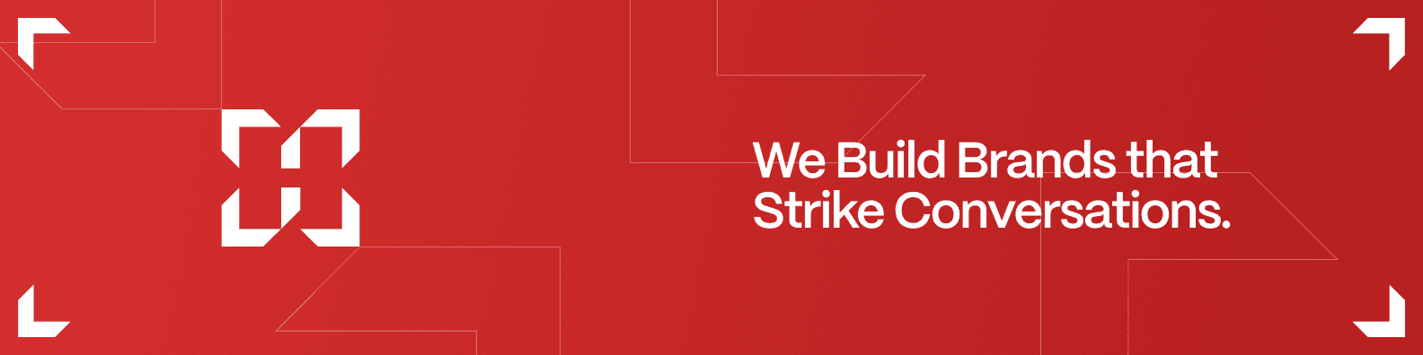
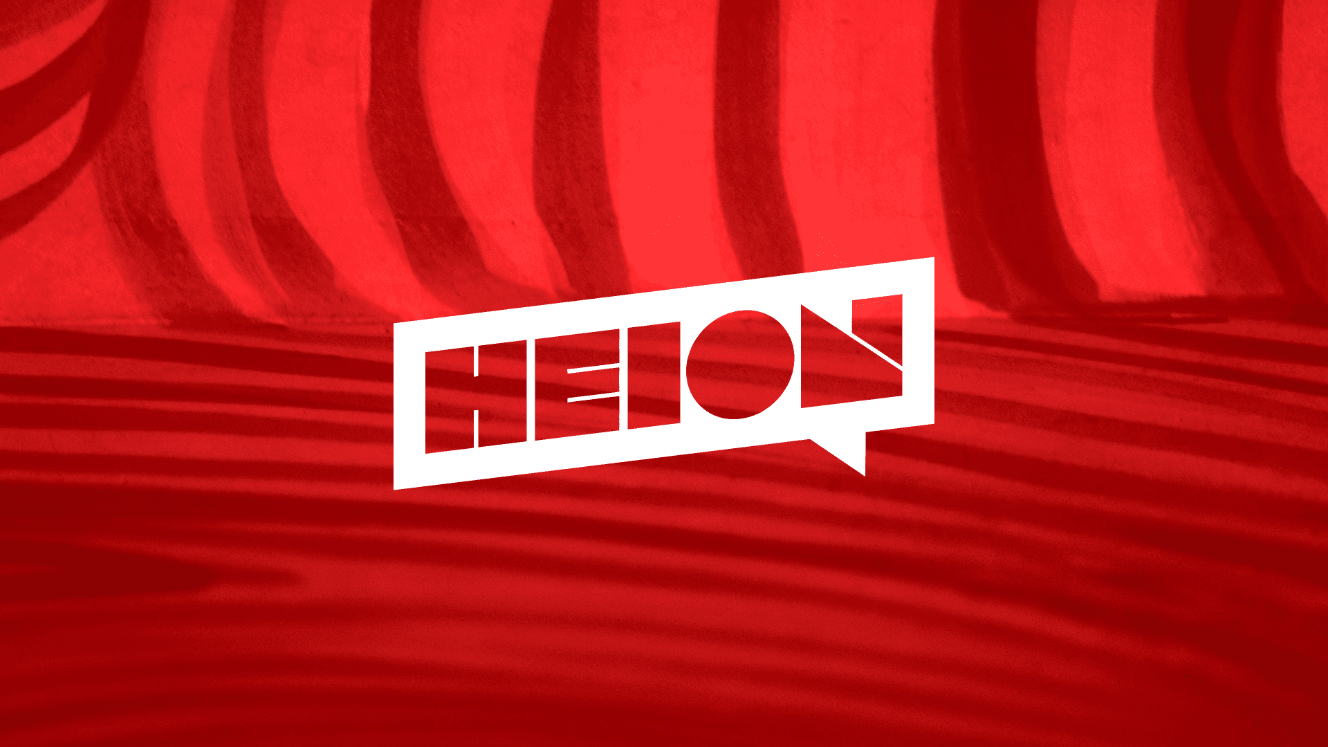
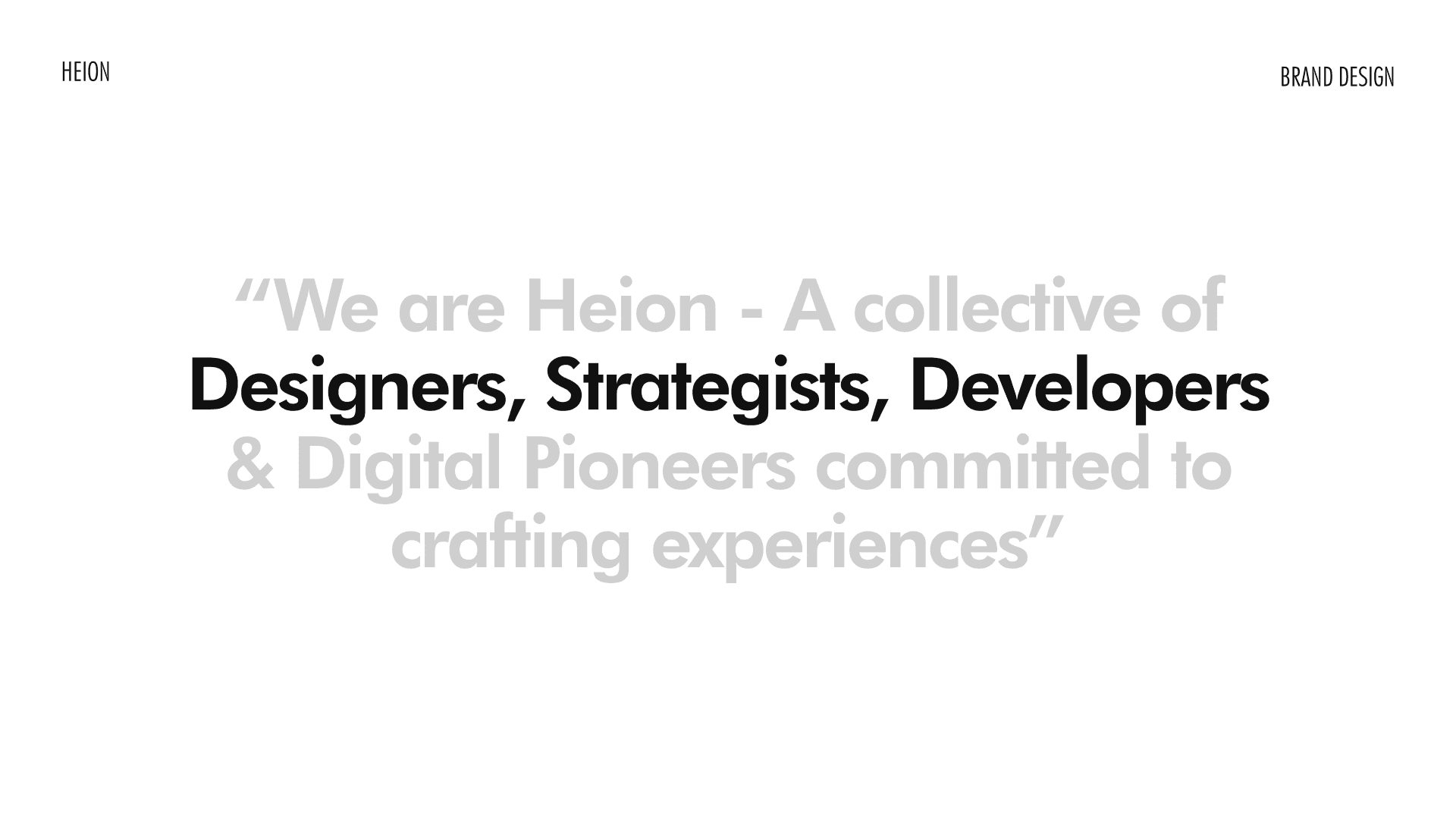
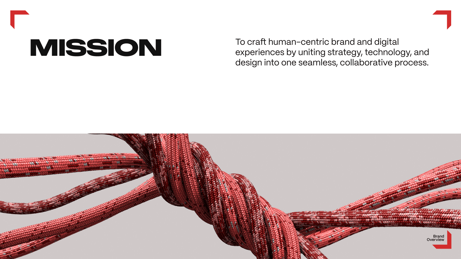
Heion is a strategy-first creative studio that brings together strategy, design, and technology under one roof to build impactful digital brand experiences.


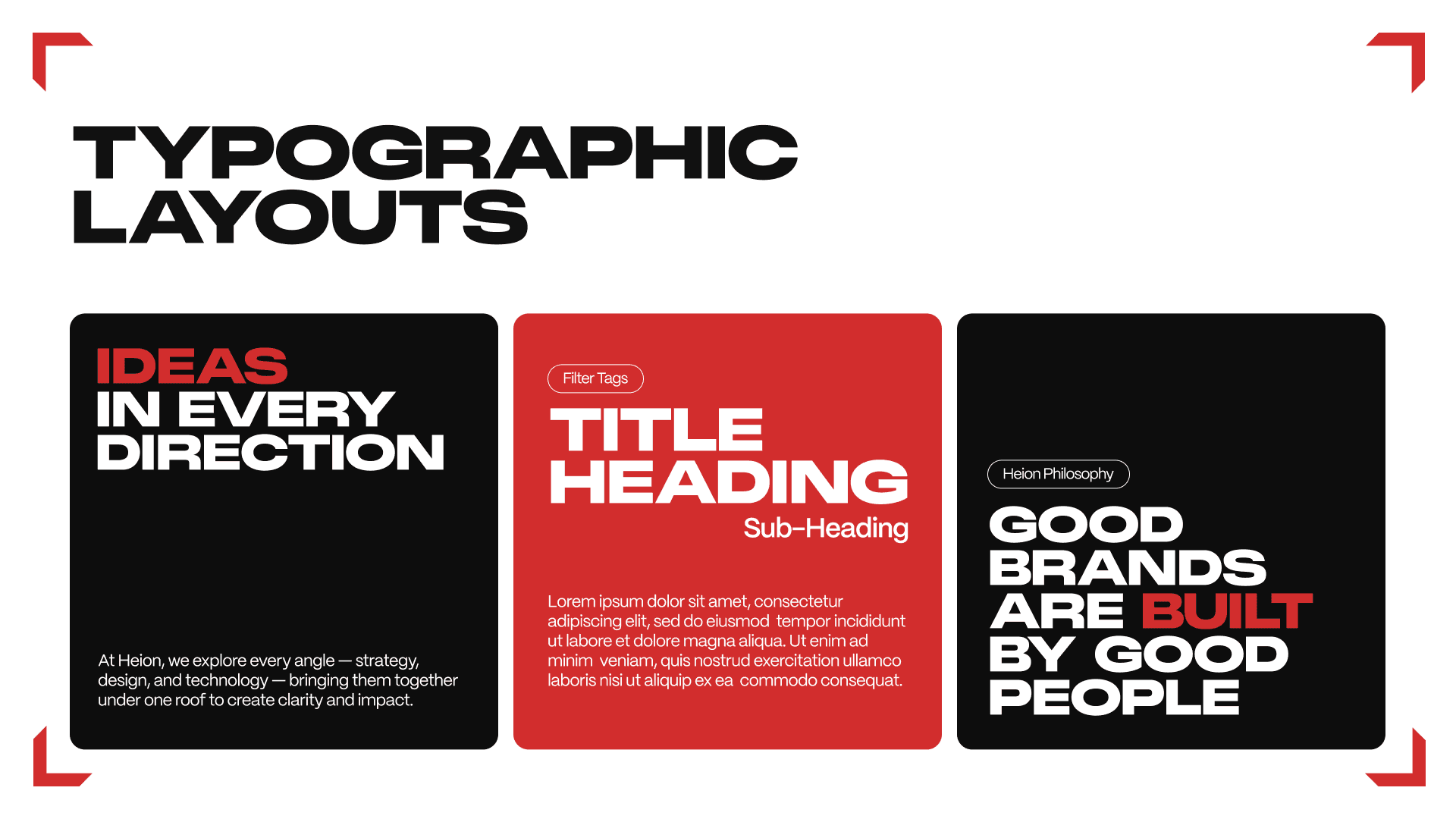
This project focused on developing a cohesive visual identity system that reflects Heions multidisciplinary nature, structured thinking, and bold yet balanced creative voice.

Client

Heion

Client

Heion

Services

Brand Identity Design

Services

Brand Identity Design

Year

June 2025

Year

June 2025

Industry

Creative Studio

Industry

Creative Studio

Brief

Brief

Brief

To design a brand identity for Heion that:

  • Represents the integration of strategy, tech, and design

  • Communicates a modern, confident, and system-driven personality

  • Works seamlessly across digital-first touchpoints

  • Builds a strong, recognizable visual language beyond just a logo

To design a brand identity for Heion that:

  • Represents the integration of strategy, tech, and design

  • Communicates a modern, confident, and system-driven personality

  • Works seamlessly across digital-first touchpoints

  • Builds a strong, recognizable visual language beyond just a logo

Multidirectional

Multidirectional

Multidirectional

Digital-first

Digital-first

Digital-first

Dynamic

Dynamic

Dynamic

Structured

Structured

Structured

Strategy-led

Strategy-led


Energy

Approach 1

Approach

#1

Approach 1

The first exploration focused on the tagline We Build Brands That Strike Conversations.


Visual language was built around:

  • Speech bubbles

  • Conversation frames


This direction strongly expressed the conversation aspect of the brand but felt more campaign-like than system-level. It captured the voice but not the full multidisciplinary structure of the studio.

Approach 2

Approach

#2

Approach 2

The second direction explored a three-pillar visual code

representing:

  • Strategy

  • Design

  • Tech

This was a clear brand design system, and a clearer service mapping but felt segmented. The disciplines appeared parallel rather than integrated.

The second direction explored a three-pillar visual code representing:

  • Strategy

  • Design

  • Tech

This was a clear brand design system, and a clearer service mapping but felt segmented. The disciplines appeared parallel rather than integrated.

The second direction explored a three-pillar visual code representing:

  • Strategy

  • Design

  • Tech

This was a clear brand design system, and a clearer service mapping but felt segmented. The disciplines appeared parallel rather than integrated.

Final Approach

Final

Approach

Final Approach

The final identity system was built around a four-arrow symbol, pointing in four directions and converging into a central form.

This became both:

  • The logo mark

  • The strategic framework

  • The visual language generator

The final identity system was built around a four-arrow symbol, pointing in four directions and converging into a central form.

This became both:

  • The logo mark

  • The strategic framework

  • The visual language generator

Conclusion

Conclusion

Conclusion

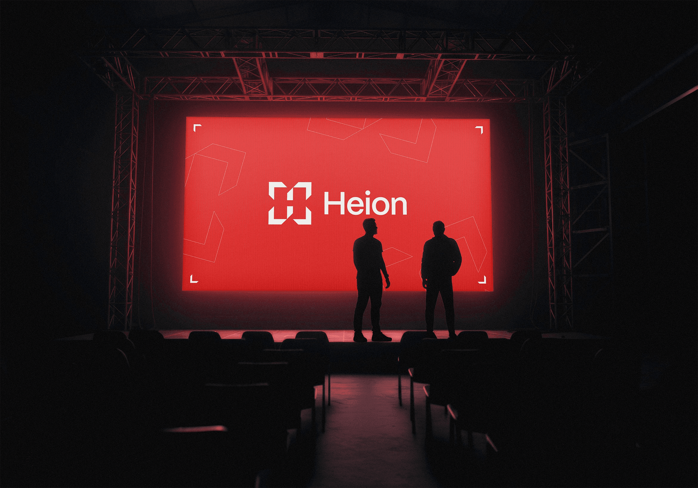
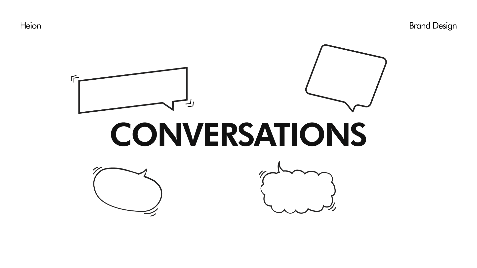
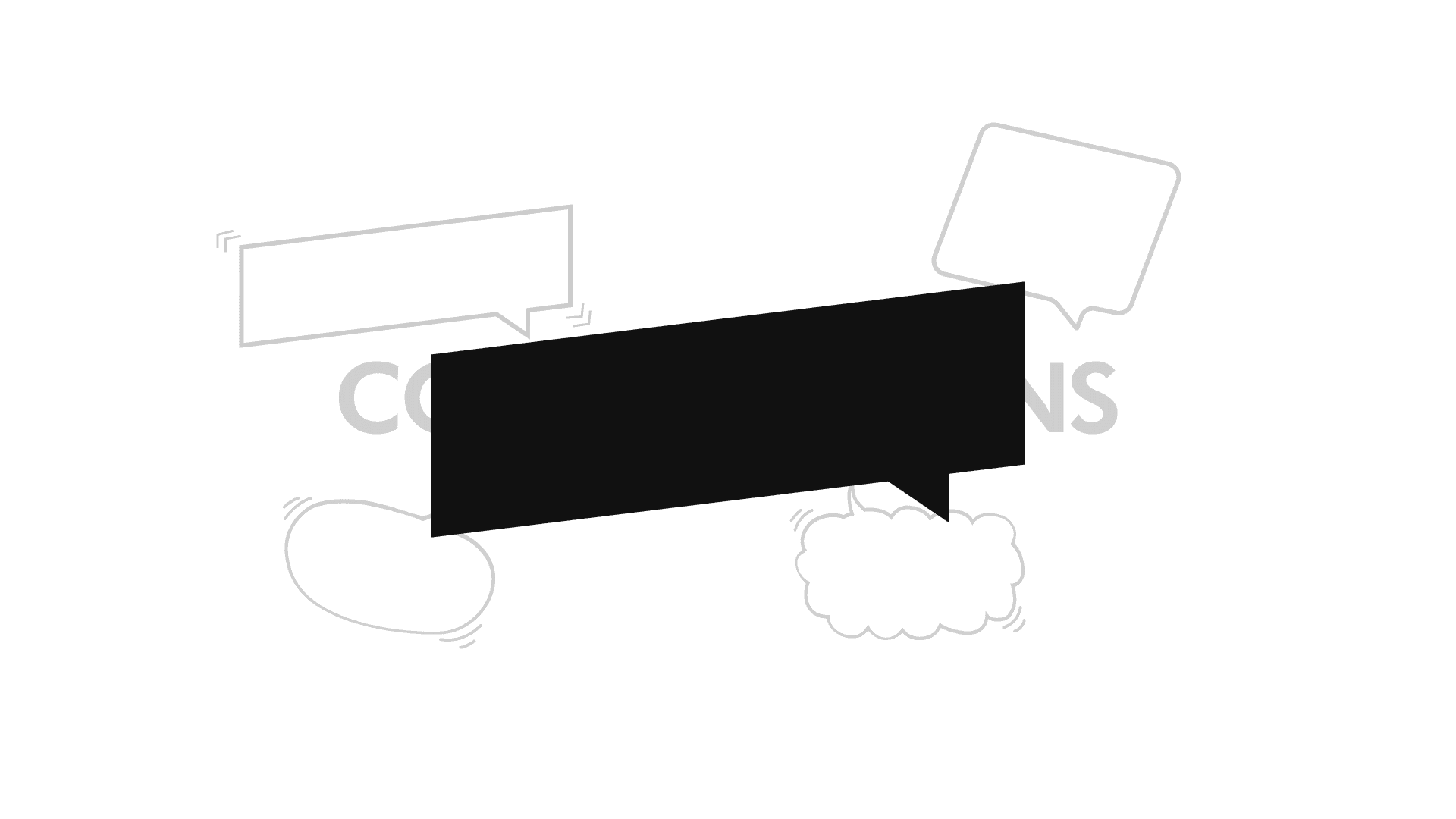
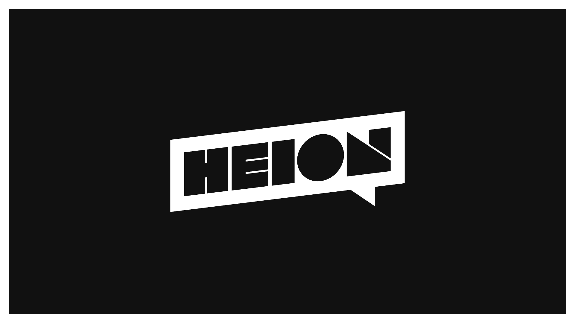
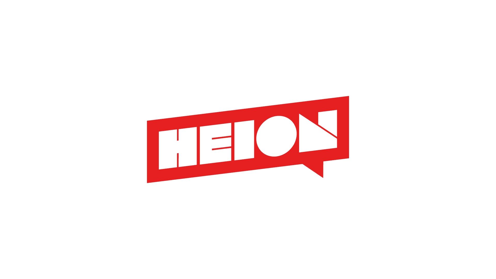
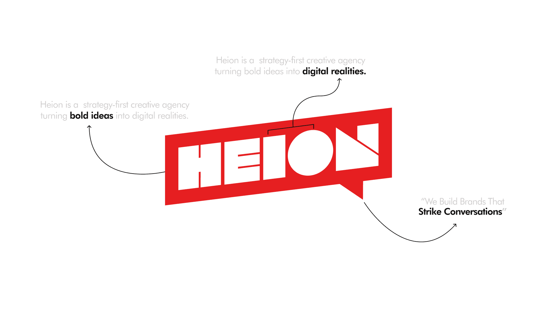
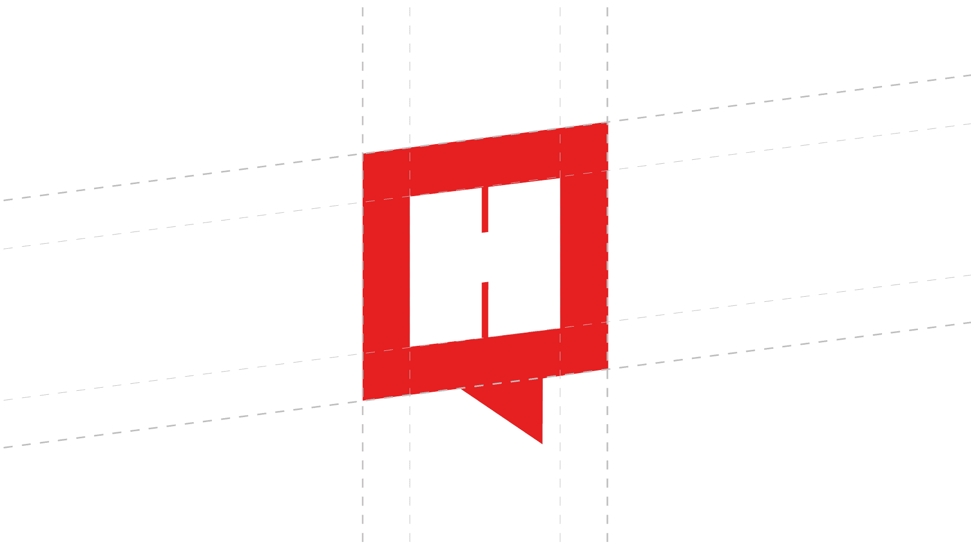
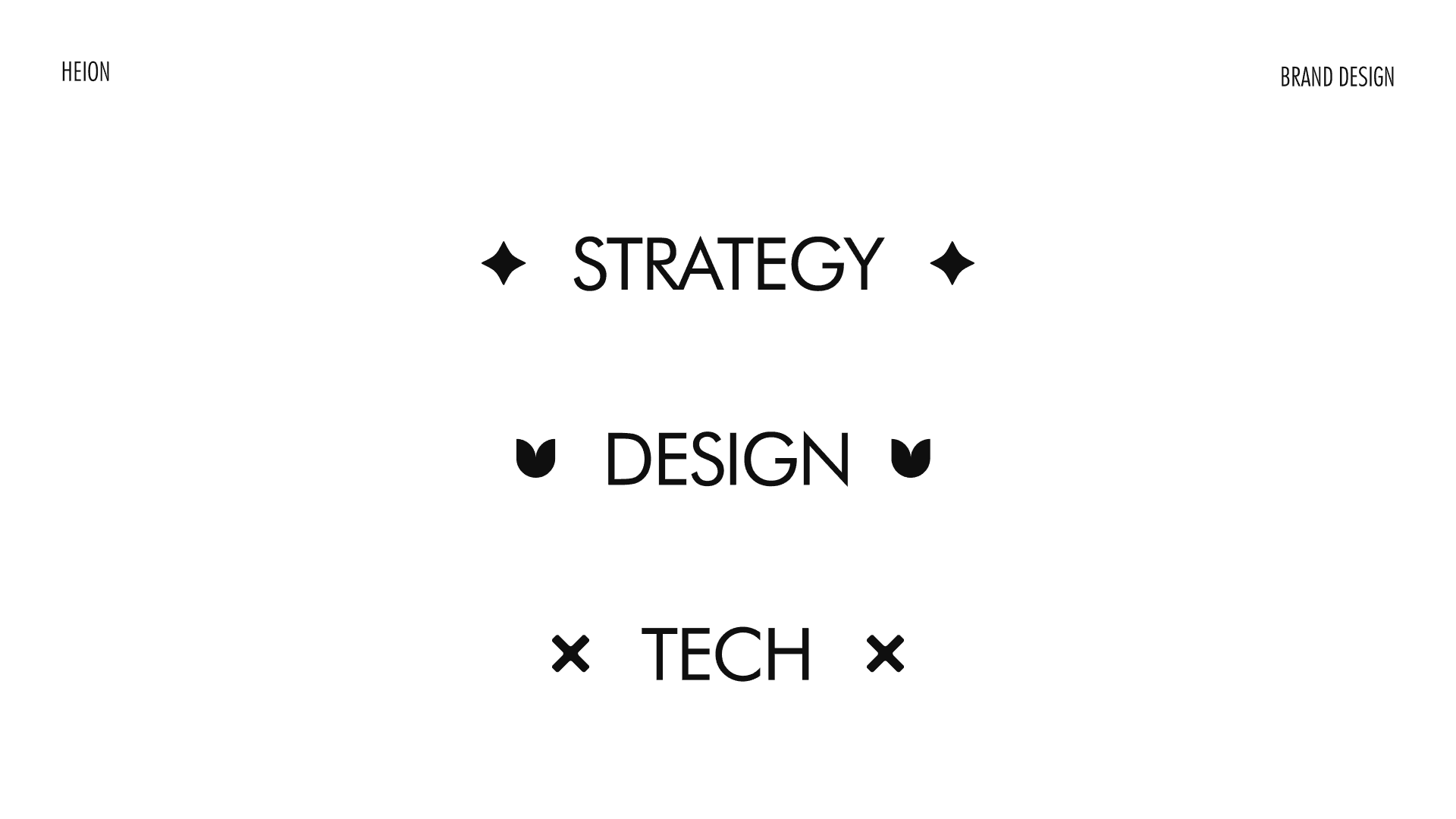
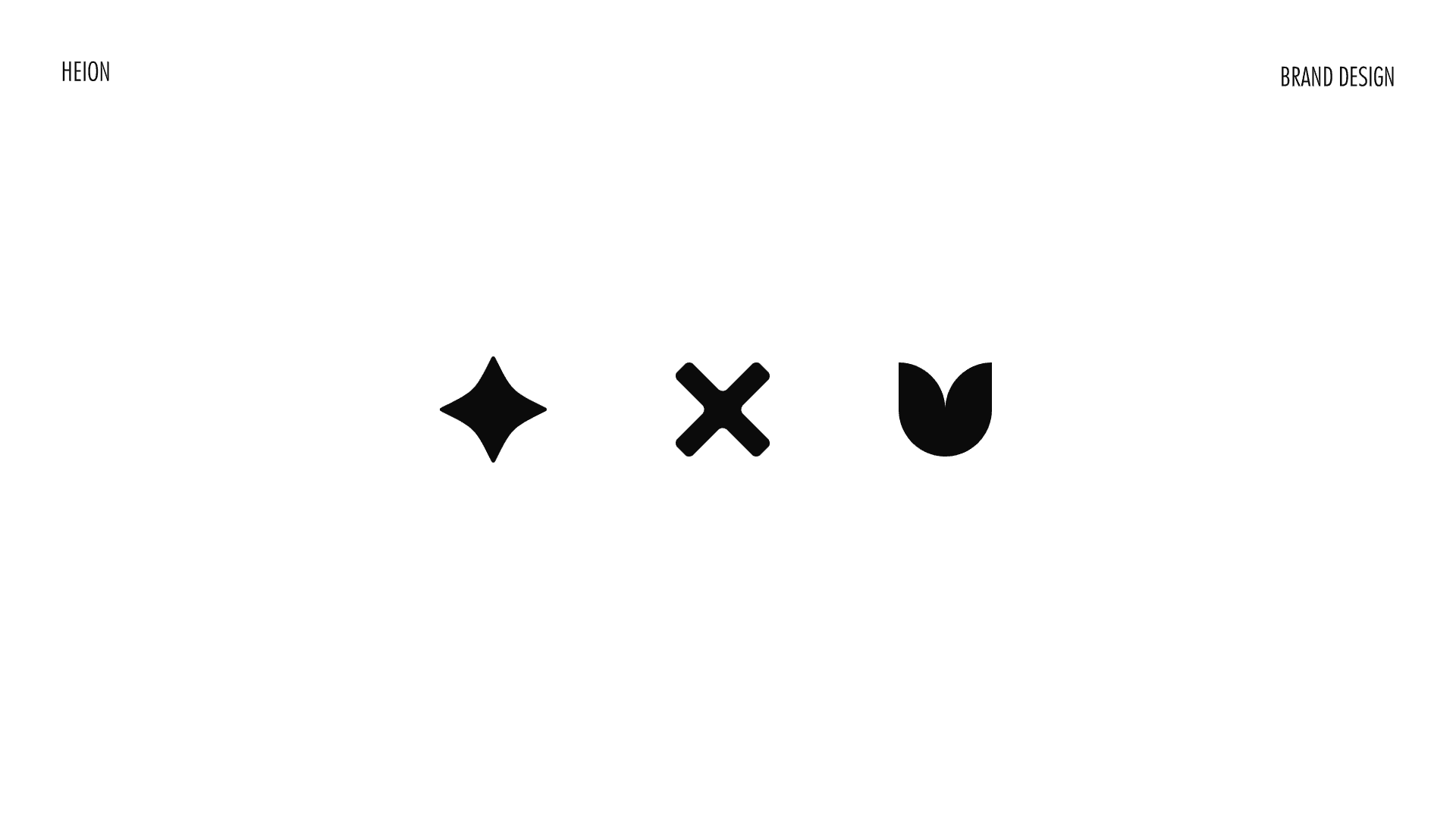
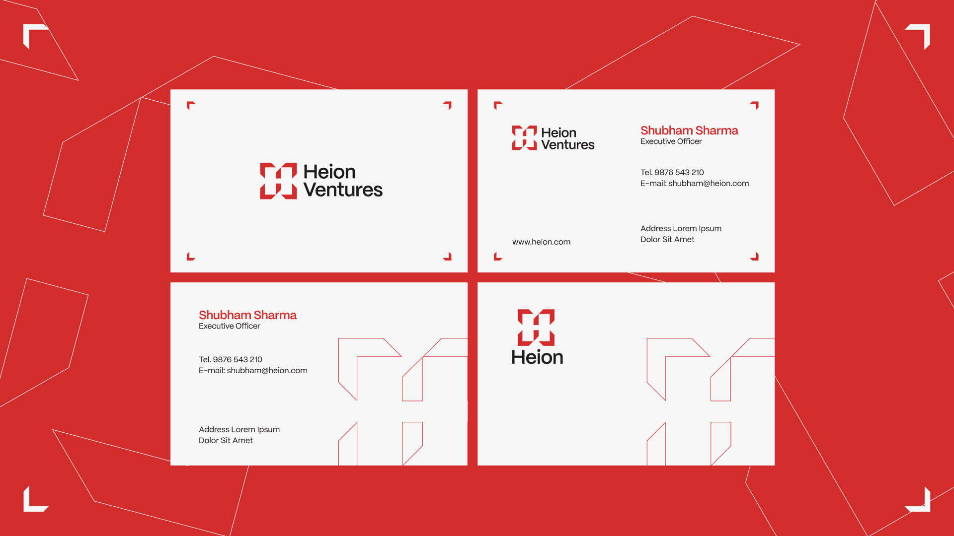
The Heion identity project evolved from message-led explorations to a system-led visual framework. Through multiple directions and iterations, the final solution centered on the four-arrow concept, which successfully translated Heions multidisciplinary and strategy-first approach into a scalable brand system.


This project strengthened my approach to building identities as connected systems rather than standalone marks, balancing concept, structure, and application, aligning visual form with strategic meaning.